

US TRADING
Redesign | Visual identity
Safety & Equipement
Kerning
UST is a company dedicated to the import and distribution of Personal Protective Equipment and Road Safety products. With over 5 years of experience, they are committed to safeguarding the health and safety of employees and workers in the Dominican Republic. Their focus extends beyond employee and company safety; They also protect the goods by supplying high-performance packaging products and disposable materials to support the production processes.
Graphic design
2024
-
Highlights:
Expanded a logo digitization request into a complete brand identity redesign.
Designed a versatile logo with a “U” submark for flexible brand applications.
Developed brand guidelines to ensure consistent use of logo, typography, and colors.
Implemented typography to improve readability and brand consistency.
Created a modern color palette with grays, orange, and blue accents.
Built a scalable visual identity system for marketing, packaging, and digital use.
-
Situation
UST Trading approached me with the goal of digitizing their logo, presenting an opportunity to elevate their entire brand identity. The client wanted a visual presence that was cohesive, professional, and adaptable across various applications.Task
My responsibility was to redesign the logo, develop a comprehensive brand identity, select appropriate typography, and create detailed brand guidelines. The goal was to establish a recognizable, consistent, and modern visual identity that accurately communicated the brand’s values.Action
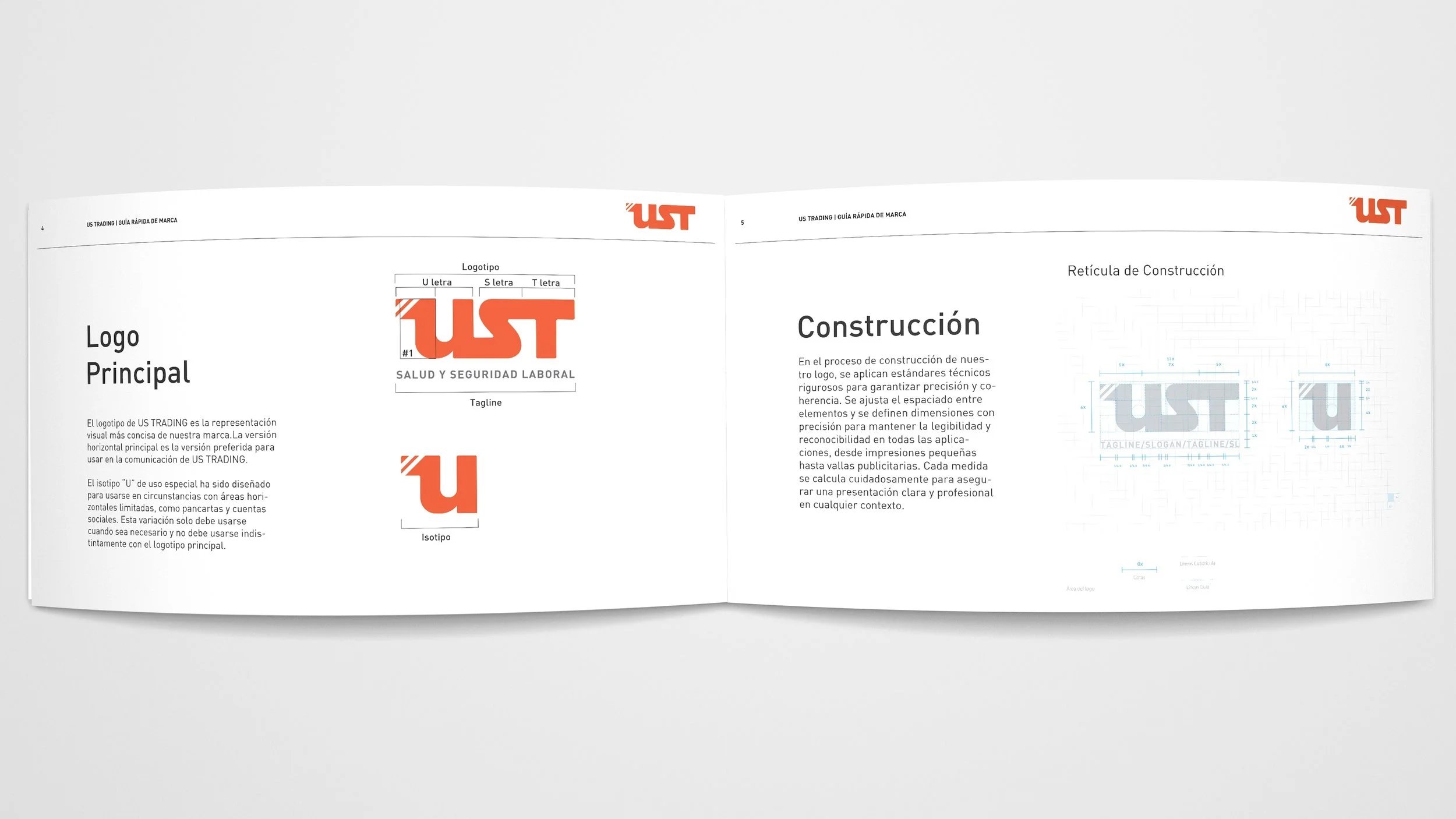
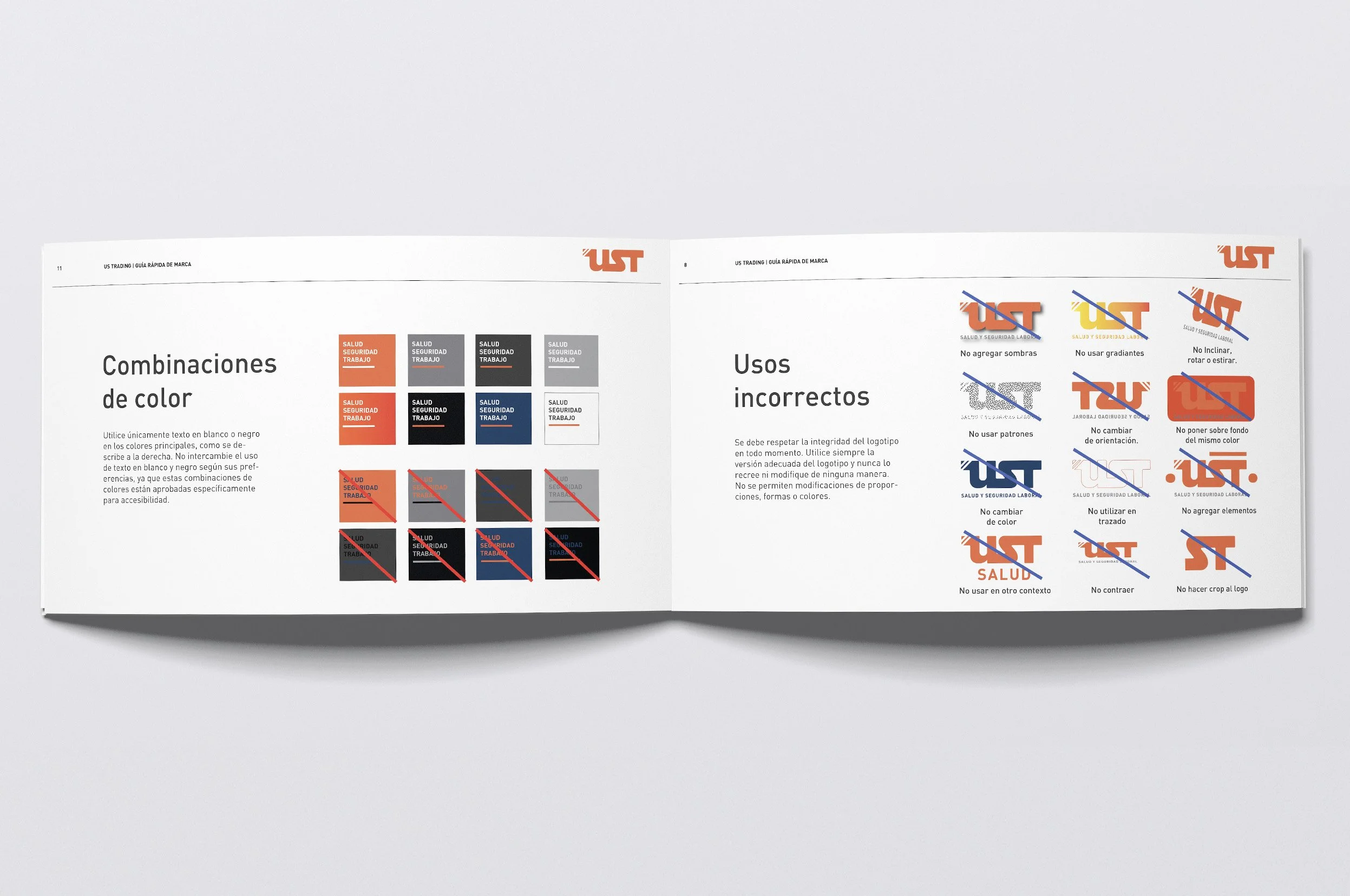
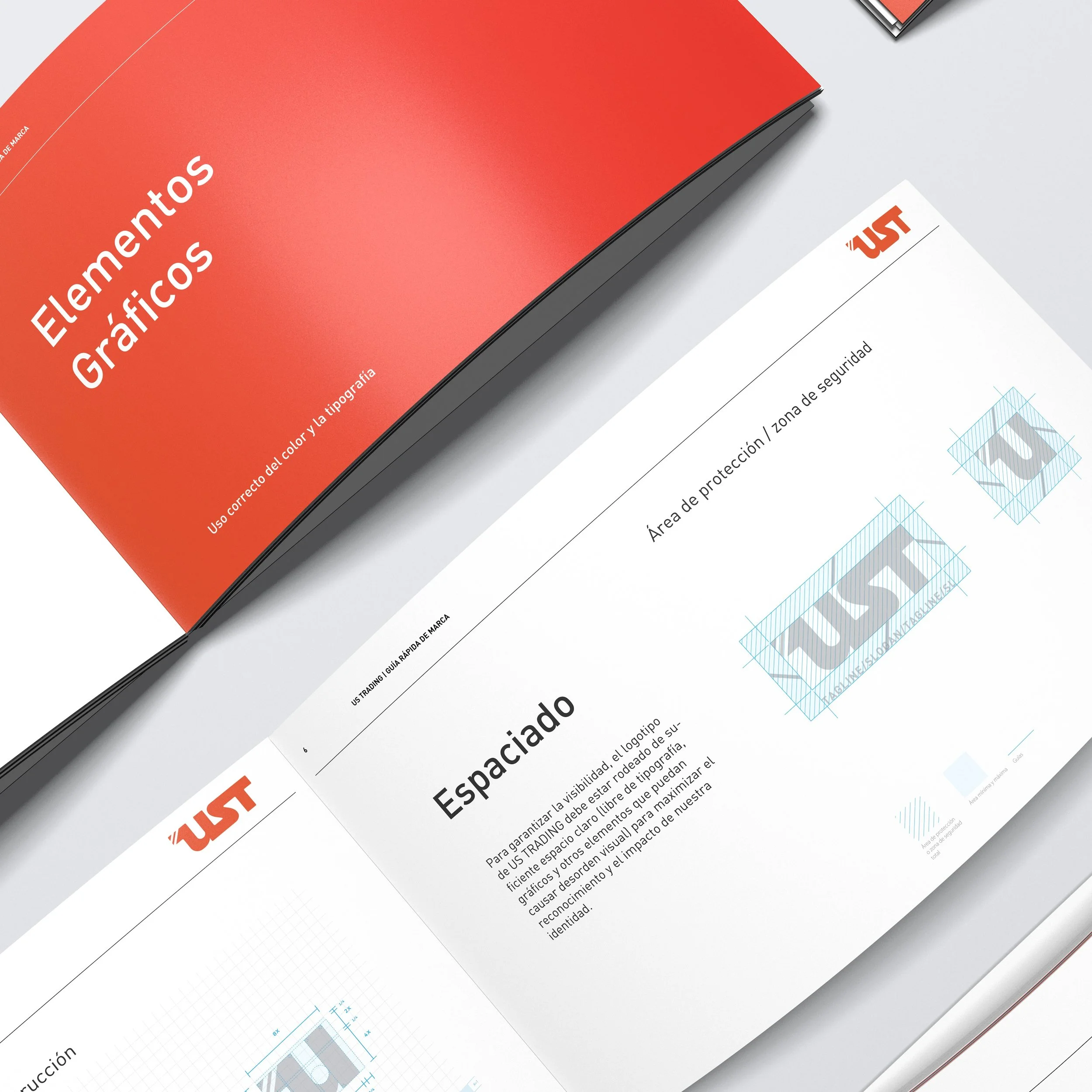
I carefully separated the letter “U” to serve as a versatile submark, enhancing the logo’s adaptability across applications. I guided UST Trading in selecting a modern, functional sans serif typeface, FF DIN, to ensure cohesion across all visual communications. I crafted detailed brand identity guidelines to maintain consistency in every interaction. To refine the logo, I applied precise kerning techniques, adjusting the spacing between each letter to improve readability and achieve a balanced visual weight. I also designed a color palette combining three shades of gray with a vibrant orange and a carefully chosen blue accent, creating a modern, dynamic, and versatile visual language.Result
The outcome was a polished, professional, and cohesive brand identity that strengthened UST Trading’s visual presence. The logo’s improved readability, versatile submark, and consistent brand application established a recognizable and memorable identity, effectively communicating the brand’s values. Additionally, the successful project generated new branding opportunities from other companies, expanding my client portfolio and demonstrating the impact of a strong, adaptable visual identity. -
Expertise:
Branding, Corporate Identity, Art Direction, 3D Modeling, Color Theory, Typography Selection.
Tools:
Adobe Photoshop, Illustrator, InDesign, Cinema 4D,
Keywords:
Construction - Road Safety - Protection - Business - Equipment- Safety - Materials - Distribution


This project has been possible thanks to US Trading.